Memory & Layout 30 Aug 2013


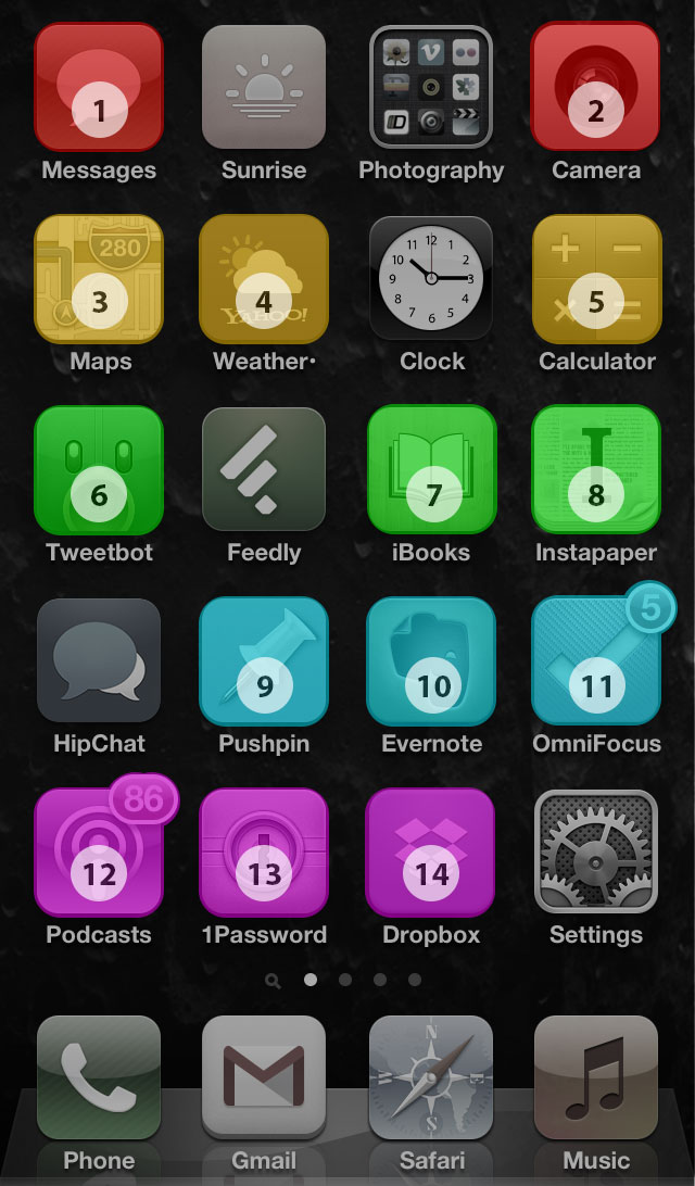
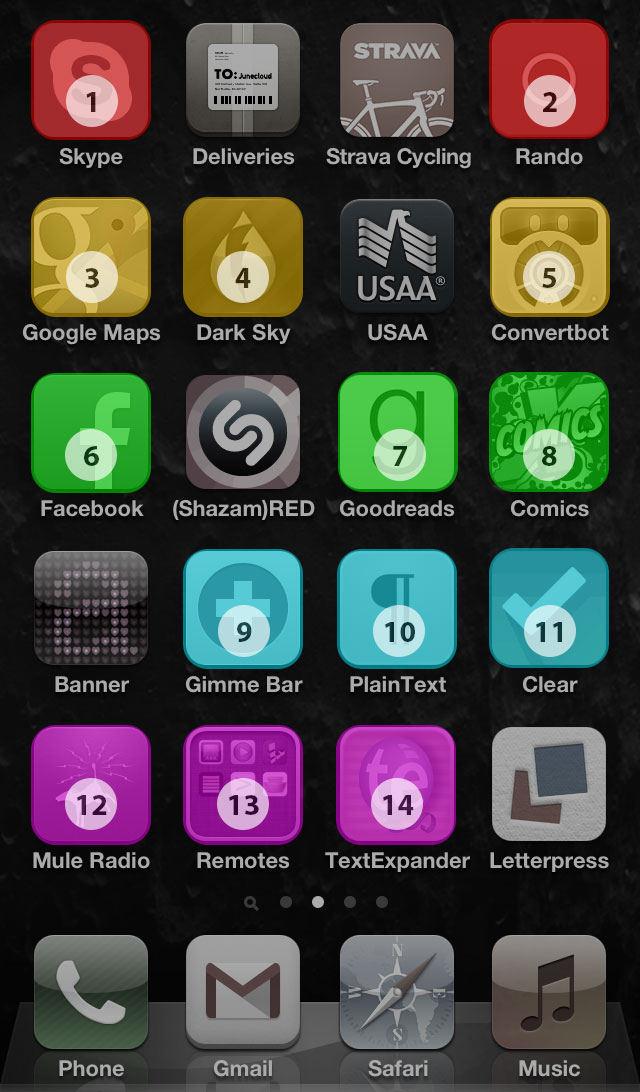
1. Messaging (Messages, Skype) 2. Photo (Camera, Rando) 3. Mapping (Maps, Google Maps) 4. Weather (Yahoo Weather, Dark Sky) 5. Numbers (Calculator, Convertbot) 6. Social (Tweetbot, Facebook) 7. Reading (iBooks, Goodreads) 8. Reading (Instapaper, Comixology) 9. Bookmarks (Pushpin, Gimmebar) 10. Notes (Evernote, Plaintext) 11. To-Dos (OmniFocus, Clear) 12. Podcasts (Podcasts, Mule Radio) 13. Utilities (1Password, Various Remotes) 14. Reference (Dropbox, TextExpander)
“Muscle Memory” describes the power of habit. As you do something over and over, you establish neural pathways, that are like a shortcut for that action. You don’t have to think as deeply about what you are doing and react instinctually. Athletes and soldiers are very familiar with this concept and spend a lot of time training with this in mind. But everyone is doing this all the time with their daily routines. You probably always brush your teeth in the same pattern. If you drive, you probably always put your seatbelt on and then turn the key, and then check the mirrors. Or the reverse, the point is, you’ve established a pattern that works for you and use it every time.
The same is probably true for how you use your phone. You've got a home button reflex that sometimes misfires when you just wanted to go back a page in the browser or app you were using. I’ve started applying this to how I lay out my phone screens.
Other people think about this stuff too. Over the years I have seen a few different approaches, broadly grouped into:
- Minimalist approaches, stripping your app collection down to just one screen.
- Intense wall-to-wall folder based layouts cramming tons of apps onto that first screen.
- Organized first screen, everything else a mess, rely on memory and search.
I've tried variants on these over the years and I have gradually settled on a muscle memory centered approach. I favor apps over folders, put my favorites on the home screen, and then I put the alternate versions in the same coordinates on a secondary and tertiary screen. So, for example, I have Yahoo Weather in the second spot on the second row and Dark Sky in the same spot on the next screen. My thumb knows where to go for weather. I don’t have to think hard and alternates are a screen swipe away.
I've done this for many apps, you can see the alignments above. Some of the alignments are more of-a-type than literal duplicate function. I'm also not too rigid, I can deviate if it makes sense. The exceptions are easy to track because everything else is organized.